Coffee Delivery Amounts
Primo Water - 2017
Our company’s water delivery route sales representatives use an iPhone app to optimize the order of stops on their route and to log and keep track of quantities of items to deliver. The application was designed to easily log inventory of water bottles and cases of water bottles being delivered. The customer sets out empty water bottles, the sales representative replaced those bottles or delivered an average quantity of water bottles according to what the customer usually consumed.
Coffee products are different than water though, especially for large commercial customers with break rooms and kitchens full of coffee supplies and products. The customers consume different products at different rates and need certain supplies at different times and at different quantities every delivery. Our water delivery application was not suited for coffee delivery route sales representatives who needed to deliver certain quantities of products depending on the customer’s needs.
Our team designed and develop a feature in our current delivery application that allowed coffee delivery representatives to effectively keep track of delivery amounts. We accomplished this by identifying the problem, speaking to users and stakeholders, and iterating through the design.
The Problem
The current water delivery app made it easy to log quantities of water delivered as our sales representatives for the most part delivered water according to how many empty water bottles the customer left out for them to pick up. The sales representative would either deliver the quantity to replace those empty bottles to deliver a quantity of bottles according to what the customer consumed on average within a monthly or weekly cycle.
However, customers don’t leave out “empty bottles” that the sales rep can count when it comes to coffee supplies in corporate break rooms. And the sales rep cannot just leave a set amount of coffee filters, K-cups, or styrofoam cups for each delivery when these products can be used at different rates and when there is limited storage space. Furthermore, it’s harder to keep inventory of all the product you are taking off your truck to deliver when one customer may have several areas in their location where they may want coffee products delivered.
We needed an experience catered for our coffee route sales representatives that allowed them to easily assess how much supplies they needed to deliver and to easily inventory how much they delivered to a customer.
My Role
UX/UI design, user research, ideation, wireframes, prototype
I worked with our IT manager and systems analysts for ideation, user feedback, and usability testing.
I communicated with developers to determine feasibility and constraints in implementation.
Research - learning about “par”
My manager started by getting in touch with route managers on our coffee routes. They were currently using the water delivery application to make coffee deliveries. They referred us to their concept of “par” - the amount of a product that a customer needed to be satisfied. For instance, if the customer’s par for a product was 5, and the customer currently had 3 left, the sales rep had to deliver 2 K-cups to satisfy the customer’s delivery. Our application currently had no way of depicting the par levels of a customer.
User Interview
We talked to our own Coffee Route Sales Representative who was delivering coffee to our office’s break rooms. She informed us on how most of the coffee route sales representatives kept track of par--by listing values on a piece of paper for each delivery point for each customer. She had to refer to her own handwritten notes for the par values and then write down the quantity of each product that needed to be delivered. Then, at the end of the delivery, she pulled out her iPhone and entered the quantities she delivered into the water delivery application.
While she did her job efficiently, her process was not streamlined at all. She voiced that she had to keep track of doing a lot of things… keeping track of her “par papers”, writing down quantities, and then entering those same quantities in separately after making the actual deliveries. This became only harder when a customer had several delivery “locations” within their own location. Consider a corporate office with several breakrooms, each needing a full stock of coffee and breakroom supplies.
User Persona
Using the insights from our interview and my current knowledge that I had built over months of interacting with our user base, I created a detailed but general user persona to help me empathize with our route sales representatives.

User: Coffee Route Sales Representative
Characteristics:
30-50 years of age
General experience with smart phones
Used to taking notes on the job with pen and paper
Pain Points:
Is literally handling many things on the job: products, phone, notepad, pen
Needs to record “par” quantities on paper - easily lost and constantly needing to rewrite
May make many deliveries to different locations within a single “delivery” to a customer and needs to keep track of the product amounts in each delivery
Goals:
To make deliveries in a timely, streamlined fashion
To deliver the correct quantities of items
To record the correct quantities of items delivered
To record the “par” quantities of a customer in a place that they can’t lose it
Storyboard
I drew up a storyboard to confirm with my manager and our systems analysts that this was the narrative that we would be aiming for.
From the storyboard, I was able to identify 3 aspects our solution needed to address:
Inputting and displaying Par quantities
Inputting delivered quantities while viewing par
Making deliveries to different delivery points for a single customer
Constraints and approach
From here, I had a discussion with my manager and our systems analysts around a whiteboard table about how we should approach the problem. I sketched quick ideas on the whiteboard and we discussed constraints.
While each of the aspects listed above was important, we were under the constraint of time… coffee sales representatives were already making deliveries with a water delivery application not suited for their needs. We needed a timely solution to hold them over in the meantime.
Phase 1:
Inputting and displaying Par quantities
Inputting delivered quantities while viewing par
Phase 2:
Making deliveries to different delivery points for a single customer
The Current delivery app
Here is our current water delivery app. The Delivery Details displays information about the customer and the quantities of items that are being delivered to them.
Phase 1: mockups and rapid iteration
I made some quick mockups on how we might display par on our current screen and ran some short cognitive walkthroughs with our system analysts who used to be water and coffee route sales reps and are familiar with how our end users work and think. With their feedback, I rapidly iterated through some initial designs.
Number fields
This mockup featured number fields that the user could tap and then enter quantities from a keypad.
Users did not like that par was to the right, as they would naturally look at par first to assess what number needed to go into the quantity field.
The lack of the + and - increase/decrease quantity buttons slowed the process down. The users generally wanted to go down the list and easily increase or decrease numbers. Tapping in a field and opening a keypad wasted time and consisted of too many actions than what they were used to.
The screen became packed. Par quantities had nothing to do with the total cost of items, and there was a disconnect with that information.
Collapsible Rows
This design kept the + and - buttons, but had each “row” collapsible in order to hide fields to avoid overloading the user with what was displayed on the screen.
These mockups were met with much the same feedback. While the users liked that the + and - buttons were present, the collapsible aspect of each item on the list made the process cumbersome with many taps needed from the user.
The collapsible aspect of each item did not seem to combat overloading the user with visuals. In fact, it seemed to do the opposite. There was just too many things to keep track of on the screen, especially with Par and Quantity fields essentially being displayed twice for every item.
Displaying It All
This mockup featured no collapsible rows, switched the positions of the par and qty columns, and kept the + and - increase/decrease buttons.
This solution was better received, though one participant voiced that it made the screen very “busy.”
Users could “go down the line” and easily edit every quantity
As with the past iterations, users questioned how multiple delivery points would be handled in this way
Addressing the future - “What about Multiple Delivery Points?”
While we had determined to address multiple delivery points in a later phase, it was still an aspect we needed to keep in mind as we designed for our first phase. How would we display delivery lists for different points of delivery for one customer when currently our app displayed one list of the total items the customer was receiving? When we implemented multiple delivery points, we would still need a final list of total quantities of items delivered to the customer as a whole.
We decided to break the par feature out into another screen, separate from the delivery details list of delivery items.
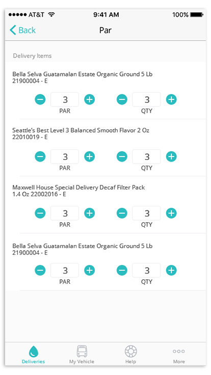
Phase 1 Solution: the “Par” screen
Having a separate Par screen would allow the user to enter and check par values on a on a screen specific to par and then come back to the delivery details screen for a full summary on the delivered items, much like a receipt of the purchased items that the customer would receive.
This would also be ideal for route sales reps that drove both water and coffee routes. They could operate their coffee route using the same UI as they would their water route, with an addition of the special Par screen only when they needed it.
Final Phase 1 Mockups
I added a button above the Delivery Items list that would allow the user to access the Par screen. The Par screen displayed a list of the Delivery Items and the par and delivery quantities of those items. The user could update par quantities according to what the customer wants and then update delivery quantities according to what they delivered.
Phase 1 Results
We released the par screen and were met with overall good feedback from coffee route sales representatives. Coffee route sales representatives were excited about the prospect of this feature replacing the use of notepads.
The main comment was that the par screen worked well for customers with one delivery point, but they needed a way to do the same thing for multiple delivery points as they still had to keep hand written notes for those types of customers. Of course, we had already determined that we would address this concern in Phase 2.
Phase 2: Delivery Points
I drew high-fidelity wireframes of how Par might look for multiple delivery points at a location. Each delivery point was represented by a card displaying a list of the delivery items. The user could swipe from card to card when visiting each delivery point.
Whereas in the past phase, the user would input Par values for each item on the delivery list, the idea for this phase was that the user would build a Par list for each delivery point by adding items to that delivery point and then inputting the Par values of those items from there.
“Edit” mode
The above mockups depict an “Edit” mode, in which the user can add or remove additional delivery points and items to those delivery points. This would be information that the sales rep would get from the customer in person, and they would enter it once. The app would then save the added items and delivery points for reference in future deliveries.
Design Feedback
I ran these designs past my manager and conducted usability tests with our analysts, and the main point of feedback was that “building” the delivery points by adding and removing items seemed like too much work. The route sales representative would not want to take the time to meticulously set up each delivery point, even if it was a one time deal. Furthermore, was it worth developing a whole “editing” component if the sales rep would only set this up once? Was there any way to make this “setup” portion easier?
Another piece of feedback to note was that the sales rep would find value in naming delivery points, as locations would not always have an obvious “order” to delivery points. The delivery points would more easily be identified by name. For instance “3rd floor break room”, or “Main floor kitchen”.
They also pointed out how having the names of the items go across the screen made them harder to read. The users were used to being able to simply scan down the left side of the list to view the names of items.
Phase 2 Solution: make it simple
My manager and I determined that it would be easier to have every delivery point display all items on the delivery ticket. This made sense as many corporate office coffee stations mostly housed the same items at each station. In this way, the sales rep could simply “go down the line” on the list and enter Par values without having to think about which items needed to be added to which delivery points. They simply needed to input numbers.
Final Phase 2 Mockups
I continued designing through several iterations to perfect small details within the design. Here were the resulting mockups…
I restructured the Par screen in a more “column-like” way, with item names aligned to the left for easy scanning. Unfortunately, we lost the + and - buttons for increasing and decreasing quantities, but the resulting screen was a lot cleaner. The keypad that opens after tapping the quantity field would also have navigation arrows that would allow the user to navigate from one field to the next, allowing for easy input.
Any quantities inputted by the user at the several delivery points would be summed up in the delivery details screen.
While there is no “edit” mode, some important “editing” features include naming delivery points, removing delivery points, and reordering. The user can do so by tapping the icons on the top right of the delivery point card. The use of icons still made it clear as to what action each button executed while not taking too much space or requiring an “edit” mode. In this way, the process of setting up delivery points is less cumbersome for the user.
Renaming a Delivery Point
Adding and removing Delivery Points
Reordering Delivery Points
The Results
The new Par feature with Delivery Points was met with good feedback. We talked to our office’s coffee route sales representative again, and she thanked us for the new feature. She stated that it made her job much easier. We also received feedback from Route Managers from several branches that the feature was being put to good use and that coffee delivery representatives no longer had to refer to pages in notepads, making the delivery process much less of a hassle.
What I Learned
Work in phases, but always look ahead. - Usually, I try to work one step at a time, but design always needs to be informed by the goal you are aiming for. We knew we would have to design towards eventually handling multiple delivery points. If we did not have this goal in mind from the beginning, it might have been difficult getting from the first phase of the design to the next phase.
Iteration —> closer to perfection. - Even though I had an idea of what the final product should look like from the beginning, getting feedback on details and iterating on that feedback was key to designing a well-rounded experience.