Delivery Scheduling & Status
Primo Water - 2020
Nowadays, when you order a pizza for delivery, you know pretty much exactly when it will arrive and can even the check the status of your delivery. Is the pizza made yet? Is the delivery guy on the way?
Our company began using a new software to schedule appointments for water filtration equipment servicing and deliveries. We needed to integrate this software and its systems into our call center and delivery driver applications.
Our team communicated with business stakeholders and end users to identify user needs and requirements. I took our findings and developed and iterated through designs for both our desktop and mobile applications.
This project is broken into two portions:
Scheduling Appointments in the Call Center Application
Updating a Driver’s Status for Deliveries
My Role
UX/UI Design, user research, wireframes, prototype, usability testing
I collaborated with a logistics director and operations analysts to determine user needs
I worked with our IT manager and systems analysts for ideation, user feedback, and usability testing.
I communicated with developers to determine feasibility and constraints in implementation.
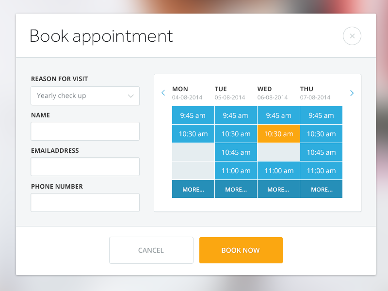
Scheduling appointments on the call center application
The problem
Our current call center application had no way for the user to select appointment time windows for deliveries. They could select a delivery date for an entire order, but the new scheduling software required appointment time windows to be selected for deliveries/servicing of certain types.
The end users
Our end users would be Customer Care Agents at our Call Center. These users undergo training to familiarize themselves with using software and communicating effectively with customers.
User Stories
I developed user stories to lay out the needs of our users. For example…
As a user, I need to know which services need appointments scheduled for them
As a user, I need to be able to see which appointment time windows are available for scheduling.
As a user, I need to distinguish filtration services that need appointments from other types of services that do not need an appointment scheduled.
As a user, I need to be able to see the appointment time scheduled for a previously scheduled service.
User Persona
Here is the basic user persona that I outlined in order to be able to empathize with our end users. I based this persona off of previous research I had conducted on site in which I sat with, interviewed, and observed a handful of Customer Care Agents using the Call Center Application over the course of 3 days.

User: Customer Care Agent
Characteristics:
20-40 years of age
Likely has previous experience as a Customer Care Agent
Pain Points:
The Call Center Application taking too long to load and having to put the customer on hold because of it
Not having enough information to understand what is happening to a customer’s order and not being able to fully communicate that information to the customer
Having too much information to read (because the info is not concise) and not being able to understand it quickly in order to fully and succinctly communicate it to the customer (who may be impatient)
Goals:
To quickly help the customer so that they can get to the next call
To minimize the time that they need to put the customer on hold
To fully inform the customer about their orders
Requirements
I took note of our high-level UI requirements as dictated by the new software. For instance, selecting appointments by a 4 hour time frame.
The business also communicated to us that certain types of servicing and orders would suggest a certain time period in which the appointment would need to be scheduled. For instance, if a filtration cooler were on fire, the business wanted the customer call agent to schedule an appointment for within 1 day. I added this requirement to our list.
Our resulting high-level requirements list was as follows:
Appointment selection by 4 hour time frame
Ability to select appointments weeks ahead
Suggested windows of time for select types of delivery/servicing
Inspiration
I then began researching how current applications such as doctor appointment scheduling applications displayed appointment selections for inspiration moving forward. Current applications seemed to approach scheduling appointment from a “month” perspective or a “week” perspective.
Task Flow
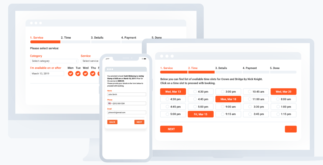
Because of time constraints, the development team and I determined that the best route to follow was to create a screen that immediately followed the application’s current Service Scheduling screen. This would allow the agent to continue through the user flows they were already accustomed to and required them to only learn one new task -- selecting an appointment window for certain filtration services/deliveries.
In this case, it was important that we informed the user that the selection of appointment time windows was a special case for filtration services.
Displaying Appointment Times
Initial Sketches
I sketched out ideas on how to display an appointment selection by a monthly view and by a weekly view.
Some key things addressed:
Brief description to the user that explained that some items needed an appointment booked
A list of items of those items needing appointments
A calendar from which the user could select an appointment
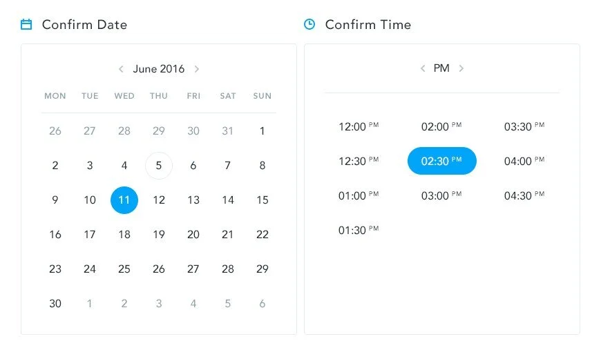
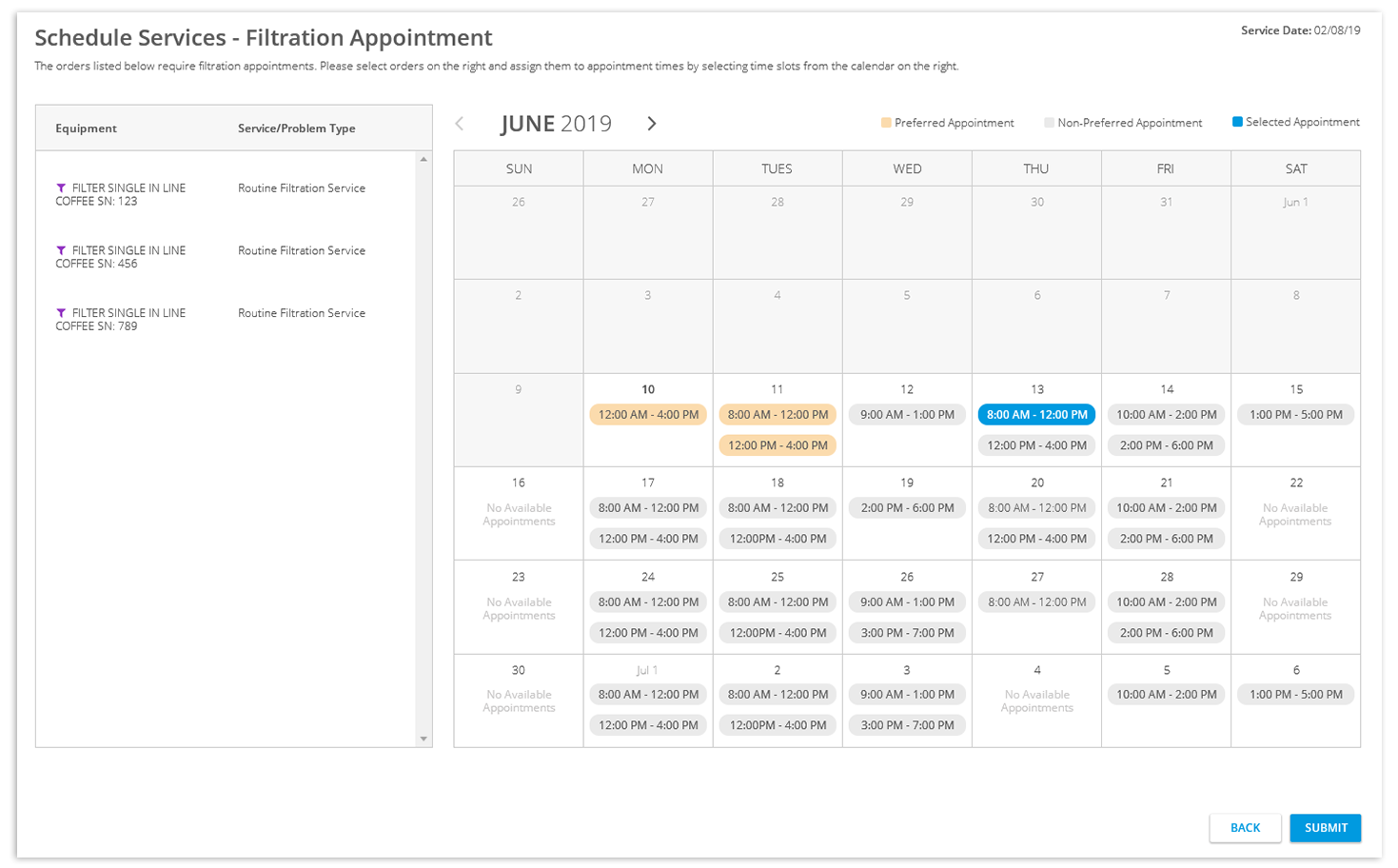
“Preferred” (suggested) appointments for certain types of services depicted by a different color on the appointment window.
From here, I made higher fidelity wireframes to get feedback from the call center managers…
The Month View
When designing and iterating on this screen, I took into account the time it may take the software to return available appointment times for multiple days. In this case, instead of showing the whole month at once, the user would see the most immediate week first and could drag the ends of the time period or enter a time period to see appointment times outside of that time frame should the customer request it.
Feedback
We received feedback that the agents thought that the monthly view was overwhelming. It was much less jarring to simply view a few days of appointments, or simply a week. This also solved the problem of the system having to load the appointment times of too many days at one time. One of the main complaints from users about the application was when the app took too long to load, so anything that we could do to avoid buffering times was appreciated.
The Week View
As I iterated on this “week view” design, I gravitated toward a view that placed the appointment time slots on the screen according to the time they represented.
Feedback
The call center managers voiced that this way of displaying appointments seemed to be more helpful in allowing the agents to visualize the appointments by time.
Scheduling Appointments by service type
I collaborated more with the developers to get an understanding of how the software would handle the service scheduling. They informed me that multiple appointment times might be required to be selected for a single session, as the system scheduled appointments for orders by the type of order.
For instance, a customer may request a filter delivery as well as servicing for a leaky cooler, however, a leak technician may only be available for appointments Monday-Tuesday while a filter delivery route sales rep may only be available Wednesday - Friday. The call center agent would have to select 2 different appointments though they could schedule the 2 orders at the same time.
I designed a way that would allow the user to select a set of services/deliveries of like types and then select an appointment for that set. When the user would select a set, the calendar with “Preferred Appointments” and other available appointments would update.
Further Iteration
I continued to update the design, created prototypes, ran short usability tests, and iterated, constantly getting feedback from our analysts, developers, my manager, and any examples of end users we could get in contact with.
Updates Included:
Aesthetic changes - to make it look more “familiar” and more consistent with the rest of the application visually
Labeling subjects in a way that is more familiar to users - Labeled the services/deliveries by the order number rather than service type, as this is how agents are accustomed to referring to groupings of services. The service typing is still visible to allow the agent to communicate this detail in terms that a customer might understand.
Using colors that were more familiar to users - Went from using a “gold”/orange color for preferred appointments to a light blue, as the agents are used to seeing shades of blue used in the application and orange/yellow seemed to depict a sort of “warning” to users. Non-preferred appointments went from gray to white, as users associated gray with being “disabled.” In the rest of the application, blue text depicts a link or clickability, so I displayed the text for the appointments in blue.
More informative indicators - Users suggested an “icon” of some sort would make it easier to depict “Preferred” appointments beyond the color. We added a star icon to the Preferred appointments.
Allowing the system to schedule the appointment - Our analysts and development teams voiced a need for a way to allow the system to schedule the appointment in the most optimal way (for the case of commercial customers who had open schedules and did not require a specific appointment time). While I first depicted this as an “Any Time” button for the user, we determined it would be more useful for the user to know that the system would handle the scheduling and labeled the button as “System Scheduled.”
The Final Mockup
Updating the driver’s status for deliveries
The Problem
Another aspect of the new scheduling software was the depiction of the status of the delivery.
Think about the different stages of a pizza delivery -- making a pizza, leaving the pizza restaurant, being en route to your house, and arriving to your house.
We needed a way for our route sales representatives to report their status on the delivery, essentially, when they left for the delivery and when they arrived.
The new scheduling software provided an application to update the rep’s status, but it did not seem intuitive towards our users. Furthermore, we didn’t want our reps juggling several apps when they already had one specially catered to them. We needed to implement this action of status updating into our current iPhone delivery application.
User Persona
Here was the basic user persona based off of insights I gained from conversations with our systems analysts (former route sales representatives) and the knowledge I had acquired over working with these users over time.

User: Filtration Technician
Characteristics:
30-60 years of age
May not have much experience using an iPhone other than using iDeliver
Has a set routine and likes to stick to it
May be impatient
Goals:
To make deliveries in a timely fashion
To execute deliveries in the streamlined way they are used to executing
To easily view the items they need to deliver and the services they need to perform
To make deliveries within the specified appointment windows
To correctly update their delivery status to convey a correct status to dispatcher
Ideation and wireframing
My manager and I began by assessing the current application that came with the scheduling software and then brainstorming ways that the Technician could easily update their status. Throughout this process, we conferred with our system analysts, who are former route sales representatives and could provide us with quick end user feedback
Weighing our options
Options like 3D touch on a delivery were thrown out, as we were dealing with sometimes older users who did not understand certain smartphone features.
We could simply display the technician’s status on the delivery at the top of the screen, but there did not seem to be any obvious or intuitive ways to suggest interaction in order update this status. Tapping on it did not seem clear enough.
Adding an “update” button still seemed to be not informative enough or streamlined. The user would have to tap “Update” and then select their status from a list. How could we make this process more efficient?
Using a “checklist” format, while efficient in interaction, seemed clunky. There would be so much information to show, and the user would resent the fact that it would get in the way of the other subjects of the screen that they wanted to focus on.
We could display the status at the top of the screen along with buttons that allowed the user to progress their status and even go back if they were mistaken. However…
The buttons did not make it clear what action was next. We could show an alert, notifying the user on what was the next status, but the explanation seemed “after the fact” and the multiple alerts and taps required to dismiss them would slow the process down for a user who wanted to make deliveries as quickly as possible.
We still wanted the main focus of the screen to be the delivery items and services to be performed. That would be what the user is most concerned with. This solution for the technician status seemed to take away from that focus
The floating action button
My manager prompted that a floating action button seemed to be a good way to prompt the user to update their status without impeding on the current structure of the screen. I sketched out ways we could display a floating action button.
One problem seemed to be that a floating action button still did not display what the status was. We would still need to display the status elsewhere (the top of the screen still made sense to us) but this seemed disjointed from the floating action button at the bottom.
Also, how could we make the floating action button depict the act of updating a status without spelling it out?
From here, it felt natural to fall onto a solution involving a floating action button at the top of the screen, depicting the technician’s status and an icon to edit that status. It was displayed in a prominent place so that the technician could not lose it but did not impede on the other important information on the screen or the tech’s process in using the screen as it currently was.
Research - Comparative Analysis
Throughout the above wireframing process, I researched how other driver/delivery apps handled the “updating status” task. For instance, food delivery apps like DoorDash and UberEats…
These apps used Call-To-Action buttons which depicted a clear action within the label used. I had been approaching the “updating status” task by assuming that we needed to show the user their current status. However, the design could be more intuitive by prompting the user with a call to action.
I consulted with our systems analysts about what terminology could be used for effective call-to-action’s. Words like “In Transit” and “On-Site” seemed to be terminology that is commonly used with our delivery driver users.
Final Mockups
Users can see the appointment time for a delivery beside the customer name.
Once looking at at Delivery’s Details, the user can update their “Technician Status” by tapping on the button at the top of the screen.
I decided to use a sort of “play” icon to indicate the “starting” of the delivery. Though “Begin Transit” was the label used for the call-to-action, I wanted to make it clear that the button would begin a process. A blinking dot indicates that the user is currently in transit to the location, and tapping the button again will update the user’s status to “On-Site”.
I also determined with our systems analysts that displaying the appointment time on the delivery details screen itself would be useful to the user as they do not always look at the delivery list.
If a user mistakenly updates their Technician Status, he can tap the “…” button on the Technician Status button to set their status manually.
What I Learned
My designs for this project were developed and released to certain branches of the company to generally good feedback. Here is what I learned from the design process.
You can’t have too much iteration. - Not to diss on my own design skills, but I don’t think there’s such a thing as reaching a “perfect” design. There can always be improvements. Further iteration ensures that you can get closer to a more “perfect” design than before.
Stuck? Steal ideas. Look for inspiration. - There were moments during this design process where I just felt stuck. Looking for inspiration and examples that solve a similar problem is a good way to get out of a rut. Start by “stealing” an idea and building from there into a solution that is a good fix for your particular problem.