Delivery Performance Metrics
Primo Water - 2019
To encourage and motivate a workforce into improvement, one must first have a measure of the success of current performance. Beyond that, the audience must be able to understand that measure of success in order to translate it into actions for improvement.
Operations Analysts within our company proposed a new metric to measure the performance of our frontline water/coffee/filtration delivery routes. The objective of this project from a UX perspective was to effectively communicate this metric to the company in order to motivate the workforce to improve execution of deliveries that are aligned with customers’ expectations.
Our team communicated with business stakeholders and end users to identify user needs and requirements. I took our findings and developed and iterated through designs for both our desktop and mobile applications.
This project is broken into two portions:
The Service Dashboard
The iPhone Delivery App
The Problem
The current process for measuring the execution of deliveries was through a metric known as “Serve Rate.” Essentially, this metric only looked at the percentage of deliveries that were marked as “served” (in this case, any delivery that had items delivered at all) not taking into account if the delivery consisted of the correct items, if items were missing from the delivery, or if the delivery was served on a later date than what the customer was expecting. While a route sales representative may successfully serve all their deliveries, this current system did not accurately depict whether the customer’s expectations were met.
The new proposed metric, called “OTIF” standing for “On Time and In Full”, focuses on the customer’s perspective and would measure the success of a run route by whether deliveries were made “on time and in full.” This includes taking into account incorrect items and amounts of items being delivered and “recovery” deliveries that would need to be made to rectify incorrect or unfulfilled deliveries made in the past.
We needed ways for analysts, managers, and route sales representatives to view this new metric.
My Role
UX/UI Design, user research, wireframes, prototype, usability testing
I collaborated with a logistics director and operations analysts to determine user needs
I worked with our IT manager and systems analysts for ideation, user feedback, and usability testing.
I communicated with developers to determine feasibility and constraints in implementation.
The End Users
Route Sales Representatives would need access to their OTIF metric to assess their performance throughout their delivery day, and Route Managers would need to see aggregated OTIF scores of the branches that they manage to assess the success of their teams. Business analysts and operational leaders would need to see this aggregated data from a larger scale and across time to observe performance trends.
User Stories
The operations analysts communicated to us a list of user stories. For example:
As a Business Analyst or Operational Leader, I need access to reports that show OTIF performance by division, region, branch, route stop, and delivery day across a date range of up to one year.
As a Frontline Manager, I need visibility in the route management applicationof each delivery in real time.
As a Frontline Manager, I need visibility into the summary of RSRs’ (route sales reps) deliveries with information on OTIF status, delivery type, and delivery dates in real time
As a Frontline Manager, I need visibility in the route management application for each delivery to see if it was visited and served with an eligible transaction in real time
As a RSR, I need visibility into the OTIF status for each delivery in the iPhone delivery app after completion
As an RSR, I need visibility into a live summary of my OTIF performance for deliveries for the day
From these stories we were able to determine which aspects of which applications we needed to address in order to meet these user needs.
The Service Dashboard
From the user stories, we were able to determine that we would need a “Service Dashboard” in our current Route Management application to allow operations and business analysts and route managers to easily view the OTIF data from various ranges of perspectives.
While there were current areas in the Route Management application where it would be useful to see OTIF data, there was no place in the current application that could offer a “full picture” on a company-wide level and in the aspects that our end users were needing.
Time and development Constraints
Since it would take a lot of time to complete an entire dashboard involving OTIF, we determined we would roll out features over time.
We determined that we could implement OTIF features in the current Route Management screens as initial phases and to have our users grow more accustomed to seeing the new OTIF metric by seeing it in their current environment. The end goal though was to have one place where managers and analysts could specifically view OTIF metric data pertaining to the entire company.
User Personas
Here were our basic user personas that I outlined in order to be able to gauge our types of users that would being utilizing the Service Dashboard. I developed these personas using the insights we gained from speaking to our Operations Analysts and experience with interacting with branch and route managers.

Operations Analyst / Business Analyst
Is concerned with the performance of the company from a larger scale (by division and region)
Goals:
To analyze how newly implemented business practices has affected revenue and performance of routes across time and across regions of the company
To assess how effective branches are in performing routes
To compare the performance of different regions of the company

Operations / Route Manager
Is concerned with the performance of their own branch and the route sales representatives under them
Is familiar with using the tools on the Route Management application
Goals:
To assess if their branch of routes is meeting company standards
To assess which route sales representatives are improving or need improvement
To assess the performance of routes in real time
To assess which types of deliveries representatives are having trouble delivering
Brainstorming
I identified the different “perspectives” from which the users may assess the information
Time
Realtime performance (today)
Past days of operation
Range of time
The company hierarchy
Division
Region
Branch
Route → from here, viewing individual deliveries
We needed to provide the users navigability across these perspectives. I brainstormed and sketched ideas on how we could display the information.
Ideas:
Presenting a “target” OTIF score to reach to easily convey if a route is succeeding/failing
Presenting revenue as another metric to measure success
Presenting another level of comparison between types of deliveries by using colored percentages in the bars of a bar graph or using multiple bars for a subject
User Research
With my ideas in mind, my manager and I interviewed Operations Analysts, asking about their needs and about the current visualization they were using to assess OTIF metrics.
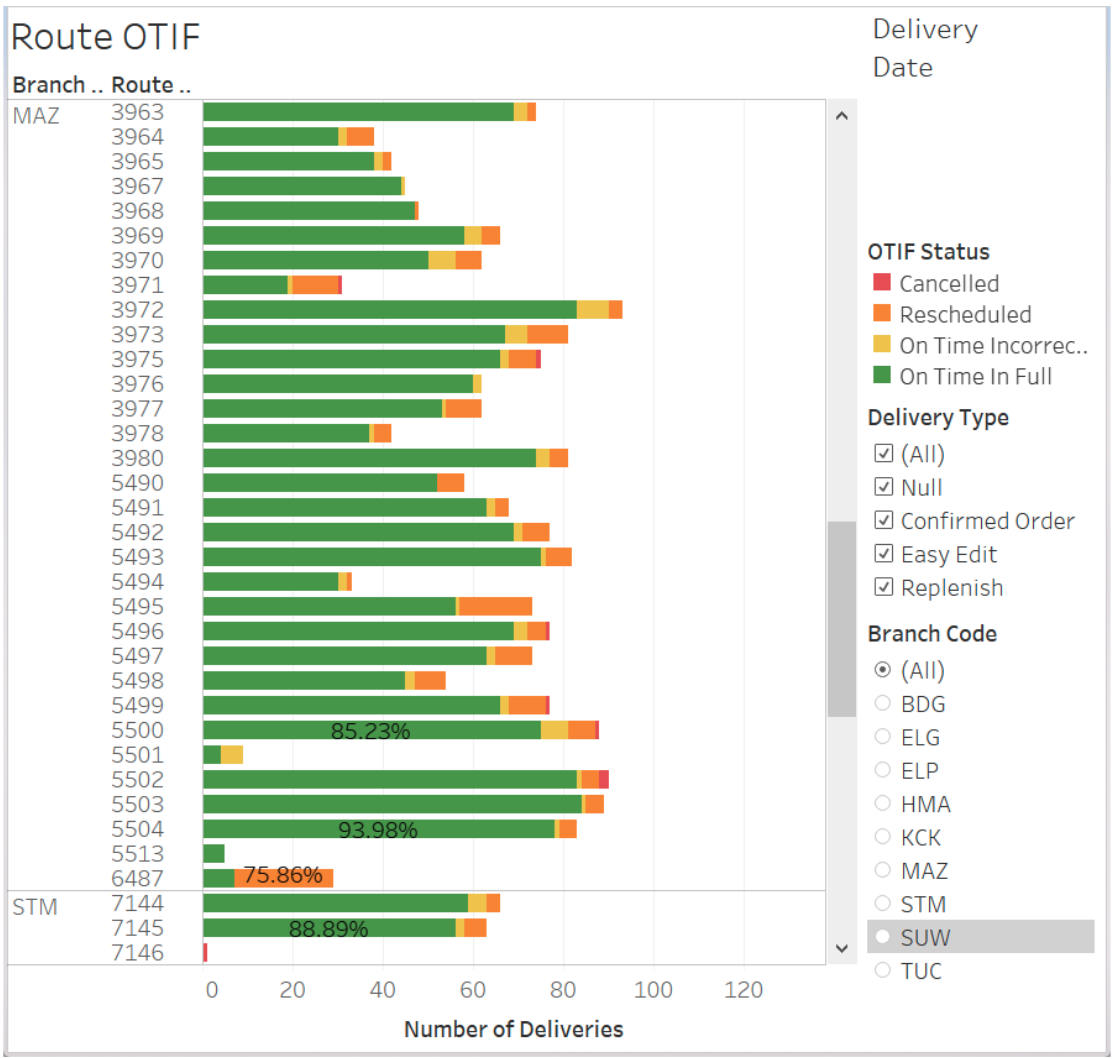
They were using Tableau to produce a bar graph that represented the amounts of deliveries routes were making, and depicting the “OTIF” statuses (statuses that are given according the how the delivery was executed) by color.
While it would seem that the main metric this graph is conveying is the number of deliveries, analysts were more concerned about the percentages of the colors within each bar. They wanted to compare these percentages across the routes.
Overall, the visualization did not allow for the users to compare OTIF performance in a concise way. For instance, it was hard to compare the score of a smaller route with less deliveries to that of a larger route with dozens of deliveries.
Takeaways
I listed the following insights from our interviews with the operations analysts:
Analysts wanted to compare OTIF scores across different levels of the company, beyond region and branch
They wanted to view “aggregate” scores, or an average, across time as a sort of summary on performance
They wanted to compare the amounts of deliveries with certain OTIF statuses on each route (a delivery-level view)
Analysts wanted to see these comparisons filtered by specific types of deliveries and customers
This added another “perspective” to view data from: types of delivery
While we had accounted for displaying the amounts of types of deliveries, we discovered that users may want to single out a type of delivery and view metrics for just that type
The Initial Phase
As an initial phase to quickly address these needs, we added a feature to view the OTIF score of a route and the OTIF statuses of its deliveries in our current route management dashboard screens. These current screens already had ways of filtering by type of deliveries and through the hierarchy of branches and routes.
This view clearly displays each route’s OTIF score while showing percentages of deliveries with certain statuses by color. At a high level, an analyst can quickly assess how well a route is performing by the amount of green in the bar.
We also provided a “drilled down” view of each route and its deliveries with color coded OTIF statuses so that the user can see details of each delivery.
Sketches and iteration
I fleshed out ideas on how the dashboard might look and iterated on my ideas toward a more logical user interface.
As I am the only UX designer working on the team, I have developed a habit of writing down all my thoughts and questions on my sketches so that I can more easily assess my ideas and concerns.
Initial sketches
Some key things addressed:
Two views that address time
Single Day
Timeline (across a time range)
Two filters to address navigating company levels
Region
Branch
A filter to address viewing the data by types of delivery
Ability to single out specific subjects for easy comparison
Ability to download results to compare subsets of data
Final Sketch Iteration
I updated the design from “single day” to a “total” score view to account for the user need of seeing an “aggregate” score across time. In this way, the user could see the total aggregate score of a route across a selected time range (from one day to one year). From there they could also choose to view the timeline to see how performance fluctuated.
User Feedback
I conferred with our operations analysts again and came away with two more takeaways:
The scale of it all - We needed to view performance on a larger scale than region and branch → this includes the entire company
Too much detail - While analysts are interested in types of delivery, they did not seem interested in knowing what amounts of types of deliveries a route or branch had when assessing performance. They might want to know the performance of a route in terms of deliveries with Type A, but when assessing the overall performance of a route, they didn’t care if it had 50% deliveries of Type A or 25% deliveries of Type B. … In other words, adding multi-colored bars on the bar graphs added a level of complexity that the users did not need.
Service Dashboard Initial High-fidelity Mockups
With the feedback we received on my sketches, I began making high-fidelity mockups of the service dashboard.
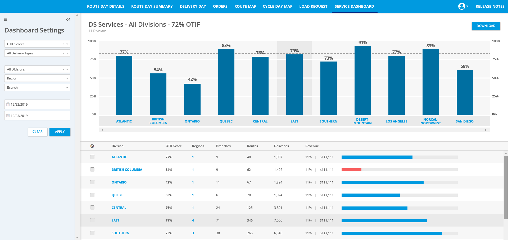
The Landing Screen
The user would input the paramaters of the information they wanted to view under the Dashboard Settings.
After clicking “Search”, the application would display the information according to the type of overview the user selected.
Further features include the following:
Viewing Details - Each subject has its details listed in the detail list on the bottom half of the screen.
Navigation to different levels of hierarchy - The user can view the regions within a division by clicking the number of regions in the detail view. From there, they can view branches in the region… and so on and so forth.
Filtering which subjects to view - In this way, an analyst or route manager can single out certain branches, routes, etc. and make comparisons between them more easily.
User Feedback
We regrouped with our operations analysts to get feedback on our mockups.
Takeaways:
Revenue visualization constraint - While revenue is a good factor of comparison, it would take a lot of effort to set goals for each level of the company and input that data for the dashboard to use. The analysts were fine with just seeing revenue as a money value instead of a percentage.
Data filtering options - The analysts wanted more specific ways of filtering the data by not only type of delivery but also type of customer. It was not sufficient to have merely one dropdown labeled “Delivery Type.” We needed to add complexity.
Improved Filtering
With the feedback, I removed the revenue visualization and added a specific filtering capability.
Service Dashboard final Mockups
From here, I kept iterating on the high-fidelity mockups to perfect certain details. Fixes included more detailed filters for types of deliveries and customers, navigation between the views of the company’s hierarchy, viewing details of deliveries, etc.
The Landing Screen
OTIF Score Overview - Company-wide level
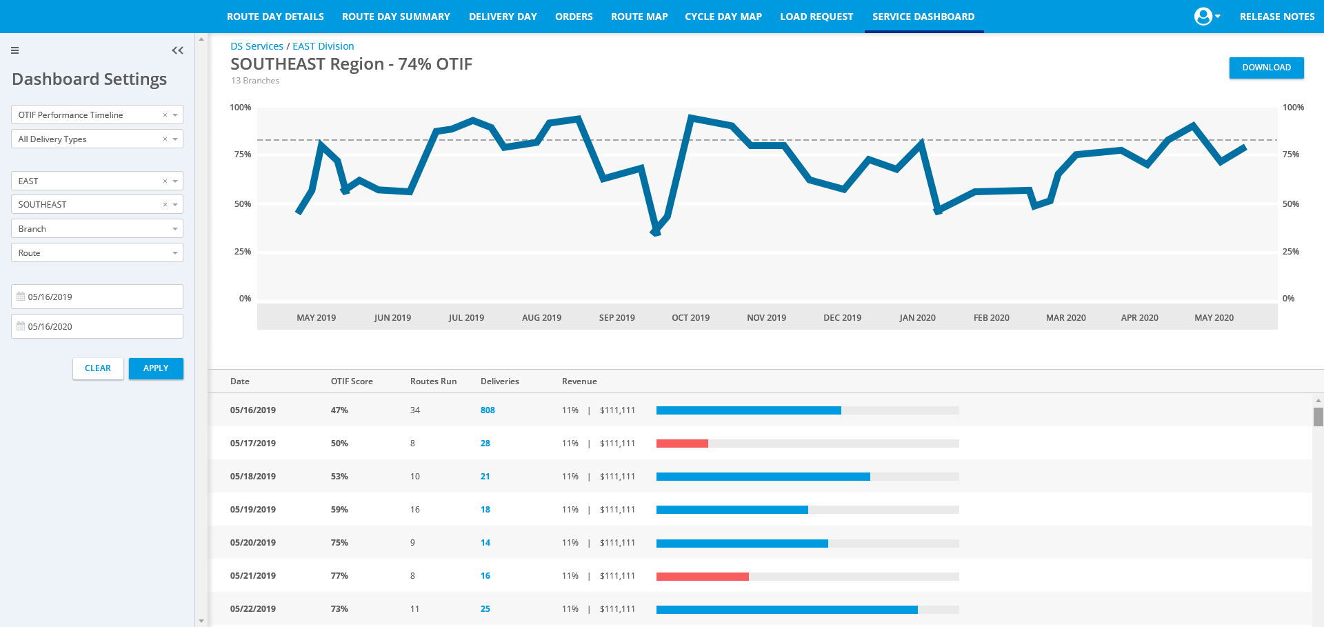
OTIF Score Overview - Branch Level
The Branch level of the OTIF score overview provides a look into the amounts of deliveries with certain statuses. The user can also view a more detailed view of the deliveries. A manager might use this feature to see which deliveries in particular are causing problems for the performance of a route.
The iPhone Delivery App
From the user stories mentioned earlier, we also needed a way for Route Sales Representatives / Delivery drivers to view the OTIF statuses of deliveries as they are being made and view their overall OTIF score / performance throughout the day and at the end of the day.
User Persona
Here was the basic user persona that I outlined in order to be able to empathize with our end user while going through the design process. I based this user persona off of insights I gained from conversations with our systems analysts (former route sales representatives) and the knowledge I had acquired over working with these users over time.

User: Route Sales Representative
Characteristics:
40-70 years of age
May not have much experience using an iPhone other than using the company’s delivery app
Has a set routine and likes to stick to it
May be impatient
Goal:
To make deliveries in a timely fashion
To be aware of the status of deliveries
To have their route perform well
To assess performance of their route to know how much they need to improve
Displaying the new delivery statuses on Completed Delivery Tags
We needed to indicate to the users the OTIF status of their delivery. The first place we could easily do this was with the tags that are displayed on completed deliveries. Whereas before the tags simply stated if the deliveries were served, rescheduled, etc, the new tags also indicated what status the delivery received according to the new “OTIF” standards (OTIF for “On Time In Full”, Incorrect, etc).
In this way, users could still view tags that they were familiar with, but with the addition of the new status information.
Informing the User on Delivery Statuses
Users did not always return to their delivery list to check the tags on deliveries. Usually, their main concern when completing a delivery is simply getting to the next delivery.
We wanted to indicate the new delivery statuses to the user as soon as they completed a delivery, without them having to look at the delivery list to see the tags.
Push Notification upon Delivery Completion
One idea was to have a push notification if the user completed a delivery with a “negative” status. This notification would have an explanation on why the delivery received the status that it received. This would alert the user on a “negative” status and allow them to read these explanations at a later time in the notification drawer if they are too busy driving to read the notification at that time.
User Feedback
I spoke to several users about this feature, and the general consensus about it was that the end users would not bother to look at these notifications. They stated that their main concern is following their routine and completing the route, and their instinct would be to immediately dismiss the notification.
Furthermore, as illustrated from our persona, we have plenty of users who do not have experience using smart phones in general other than to use the iDeliver app. Their notification drawers may gather up with unread notifications that have repetitive explanations.
Brief Indicator upon Delivery Completion
We determined that we would add on to our current functionality of showing a brief overlay message after the delivery is completed.
Originally this message just displayed that the delivery was confirmed or closed, but now it would also display the OTIF status of the delivery. This allows for the user to still be informed of the status while not being impeded with extra notifications.
Using this already existing feature would also save on development time (we had a lack of developers at the time) by using a current feature and would allow the user to continue going through the user flow that they were accustomed to.
Displaying Daily OTIF Scores
We also needed a way to display OTIF scores to the delivery driver. The driver may want to check his performance as he progressed through the day.
Initial Sketches
I sketched some ideas on how we could display this on the screen displaying the user’s list of deliveries, so that the user could quickly consult it as they made deliveries. This included ideas concerning a bar or pie chart depicting percentage.
A Constraint
I discussed the design ideas with the developers, and they informed me of the constraint that the app would be pulling the OTIF score data from a different database than the one giving the data for the deliveries shown on the screen. It would have to be loaded separately from the delivery data, so we would need a way for the user to get the data for the OTIF score, whether that be a separate button or having it on a separate screen that loaded that data.
Viewing OTIF Score by tapping a button
With the constraint in mind, I mocked up how viewing the OTIF score might look if the user were to have to tap a button to view it.
An “OTIF Score” Tab
The other option was having an entirely different tab that displayed OTIF scores. An entire screen dedicated to the OTIF score would allow for more real estate.
As one of the user goals was to assess performance in order to improve, I figured it would be helpful or encouraging for the user to see performance across time (at least for the past week) to see if there was improvement or a need for improvement.
User Feedback
I spoke with users to assess how they would approach viewing their OTIF Scores. Most said that their main concern would be to view their performance for that day, but also that it would be an interest to view past performance if it were possible.
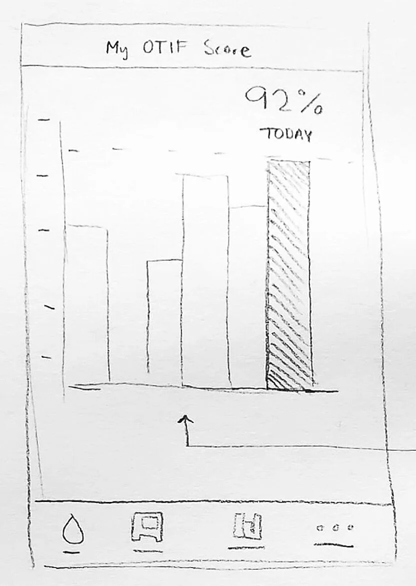
Final Mockup - “My OTIF Score” screen
I drew up a design that displayed the current day’s OTIF score in prominence (the colored bar). Past scores are indicated by the gray bars and are intended to be viewed to see progress. The user could tap on the gray bars to view the individual scores from past days.
I iterated on the design, created prototypes, and got general user feedback to iron out the details of the screen. The end result is below.
Features to note:
Last Sync Time - to inform the user if this score is up to date. Nothing worse than completing deliveries and expecting your score to be higher, but then seeing that it’s not.
Aesthetic - I made the screen “feel” like the rest of the app. Thin lines, rounded corners, shades of gray.
Always show today’s score by default - The user’s main concern would be their score for the current day. The design shows today’s score in prominence by default, and the user can see progress by viewing the bar graph as a whole. If they want details on past scores, they can view them by tapping on the gray bars.
The Daily Summary
If the user is not interested in viewing their progress or their OTIF Score throughout the day, they are shown their final score for the day after completing their deliveries in the Daily Summary screen.
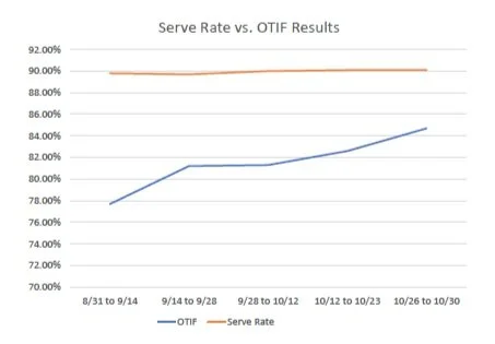
The Results
The OTIF project was developed into a Tableau dashboard. Within 2 months of use from September 2020 to October 2020, OTIF delivery scores across the company had improved by 7%. Delivery routes saw improvements with the amount of deliveries needing to be rescheduled (10% impact) and the amount of incorrect deliveries (4% impact).